Kenedy County, Texas has about 400 residents and 133 private-sector jobs. Sixty-nine of those jobs — 52% — sit in a single industry: utilities.
The other 64 jobs? The Census Bureau won't say what they are. Not because the data got lost, but because federal disclosure rules block Census from publishing any industry breakdown thin enough to work backward to a specific employer's payroll. In Kenedy County, every category outside utilities — retail, construction, health care, food service, all of it — falls under that line. The county has one business the government can talk about, and a second half of its economy it's not allowed to describe.
That's not a data gap. That's the finding.
We checked every county in the country
Using County Business Patterns — the Census Bureau's annual employer-level census, covering every county, updated yearly, almost never covered in the press — we calculated what share of each county's private-sector jobs sit in a single industry, going back to 2017.
253 counties, 8% of the total, have one sector accounting for 40% or more of jobs in 2023.
Most of them are still fine. A county where manufacturing is 45% of jobs usually still has a real hospital system, a real retail sector, a real construction industry underneath it — just a big anchor employer sitting on top. Concentrated, not fragile.
Four counties don't have that cushion. In each of these, Census can't legally disclose a second industry — nothing else in the local economy is large enough to clear the reporting threshold:
- McPherson County, NE — retail trade, 75% of jobs, 72% of payroll
- Kenedy County, TX — utilities, 52% of jobs, 64% of payroll
- Loup County, NE — retail trade, 48% of jobs, 26% of payroll
- Hayes County, NE — retail trade, 45% of jobs, 30% of payroll
If the dominant employer in one of these counties took a hit, there's no visible second economy to fall back on. That's not rhetorical — it's literal. Zero other sectors, on the record.
2023 is the worst year we have on record
CBP goes back to 2017, so we ran the same check for every year since, counting how many counties had zero visible backup industries at all:
2017: 0 — 2018: 1 — 2019: 0 — 2020: 2 — 2021: 1 — 2022: 1 — 2023: 4
Four is the high point across the seven years we have data for. And one county has been heading there in a straight line.
McPherson County, Nebraska has had zero visible backup industries every year since 2020, and its dependence on retail trade has climbed every single year since: 53% of jobs in 2020, 60% in 2021, 74% in 2022, 75% in 2023.
Kenedy, Loup, and Hayes are all new arrivals to the list this year — and Kenedy's case is a little counterintuitive. Its own concentration actually fell from 2022 (64% to 52%). What changed wasn't that utilities got bigger; it's that the one other industry that used to clear the disclosure line quietly shrank below it. Kenedy didn't get more dependent on its biggest employer. Its second-biggest employer just got too small to count.
Then there's Terrell County, Texas, which doesn't even make our 2023 list — because it isn't in the 2023 data at all. Terrell had zero visible backup industries every year from 2017 through 2022. This year, Census recorded that the county has 44 private-sector jobs and disclosed nothing else about them. Not which industry. Not how many businesses. Terrell didn't get less risky. It went dark.
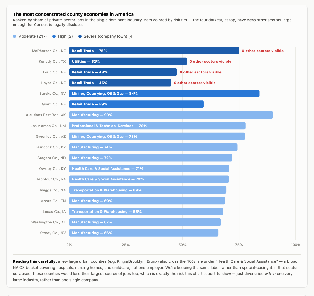
McPherson, Kenedy, Loup, and Hayes are the only four counties where Census discloses zero other sectors — everything below them on the list still has a visible second industry, even if a small one.
Why this should matter to city managers more than economists
Job counts are the number everyone quotes, but they understate the real exposure, because not all jobs generate the same tax base. We pulled CBP's payroll figures for the same counties and compared each dominant sector's share of local jobs to its share of local wages.
Across all 253 concentrated counties, the dominant sector averages 54% of total private payroll — five points higher than its 49% average share of jobs. Wages, not headcount, are what feed local sales-tax collections and, indirectly, property values. A city budget doesn't move with a jobs number. It moves with payroll.
Kenedy County is the sharpest example: utilities is 52% of jobs but 64% of payroll. Those are better-paying jobs than the rest of the local economy, so the county's revenue base leans on that one sector even harder than its headcount suggests. Loup and Hayes run the other way — their dominant sector, retail, pays below the county average, so their wage concentration is actually lower than their jobs concentration. Not every "concentrated" county carries the same exposure, and the jobs number alone won't tell you which kind you're looking at.
One limitation worth stating plainly: we don't have direct county-level property tax or municipal revenue data. The Census government-finance survey we track is state-level only. Payroll share is the closest county-level proxy available — a screening signal, not a substitute for an actual revenue audit.
Four counties are the extreme case. The pattern underneath it is bigger.
Zoom out from McPherson and Kenedy, and this stops being a story about four small counties and starts looking like a map of American industrial geography. A belt of manufacturing-dependent counties runs through Indiana, Ohio, and Kentucky — RV plants, auto suppliers, appliance factories, each one the load-bearing wall of its county's job market. Mining and oil counties across Nevada, North Dakota, and West Texas show the same shape. So does Aleutians East Borough, Alaska, where seafood processing alone accounts for 90% of private employment.
A handful of large urban counties cross the 40% line too — Kings County (Brooklyn) and the Bronx, both under "Health Care & Social Assistance." That's not one hospital. It's every hospital, nursing home, and childcare center in the county, bundled into a single federal category. We didn't filter these out, because the underlying risk is real even if the shape is different: if the health care sector took a serious hit, these counties would lose their largest source of jobs too. It's concentration inside one very large industry instead of around one company — a different flavor of the same exposure.
What this data can tell you
If you're a city manager, economic development officer, or local official in a county that leans on one employer or one industry, this is exactly the kind of analysis that should be on the table before budget season — not after a plant closure. We built this dataset to cover every U.S. county back to 2017: jobs share, payroll share, and the year-over-year trend, and we can run the same breakdown for your specific county.
If you want to know how exposed your local economy actually is, reach out.
Source: U.S. Census Bureau, County Business Patterns, 2017–2023 (2023 is the most recent vintage published; 2024 has not yet been released). Concentration measured as one NAICS sector's share of total private-sector employment and payroll. Sectors are excluded from disclosure when too few establishments report a value. County-level government finance and tax data is not available in our pipeline — Census's finance survey is state-level only — so payroll share is used as a proxy for tax-base exposure.